Designing digital card access:
Designing digital card access meant creating a fast, reliable way for members to view and share their insurance information without relying on a physical card. The experience prioritizes clarity, accessibility, and real-world usability—so users can quickly access plan details, download or send their card, and stay prepared in moments that matter most.
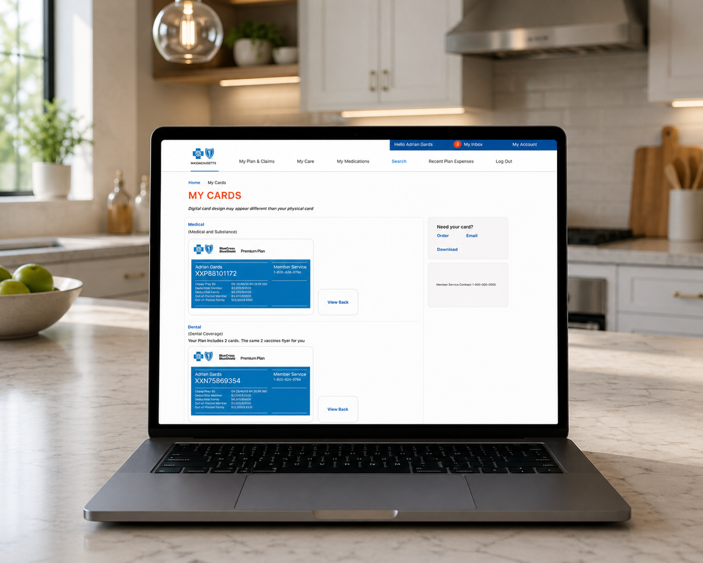
Click image to enlarge
Case Study:
Project Overview:
Blue Cross Blue Shield needed a modern, accessible way for members to view and use their insurance cards digitally. The goal was to replace physical dependency with a seamless, self-service experience across web and mobile.
Problem:
Members frequently struggled with:
- Not having their physical card when needed.
- Difficulty accessing plan details quickly.
- High reliance on customer support for basic information.
This created friction during critical moments like doctor visits, pharmacy pickups, and claims inquiries.
Goal:
Design a digital card experience that:
- Provides instant access to insurance information.
- Reduces support calls.
- Works across devices in real-world scenarios (on-the-go, low attention moments).
Solution:
I designed a “My Cards” dashboard that centralizes all member card information in a clear, scannable format.
Key Features:
- Digital ID Cards (Medical + Dental) with essential details front and center.
- Quick Actions: Download, email, or request a physical card.
- Clean Information Hierarchy for fast readability in high-stress situations.
- Responsive Design optimized for desktop, tablet, and mobile use.
- Persistent Navigation for easy access to claims, care, and medications.
Design Decisions:
- Card-first layout → Mimics physical cards to reduce cognitive load.
- Blue color system → Reinforces trust and brand recognition.
- Whitespace + grouping → Improves scanability and accessibility.
- Action placement (right rail) → Keeps primary tasks visible without cluttering the card.
Impact:
- Reduced friction during check-ins and pharmacy visits.
- Improved task completion speed for accessing member info.
- Decreased dependency on physical cards and support channels.
- Action placement (right rail) → Keeps primary tasks visible without cluttering the card.
(Estimated)
- ~20–30% faster access to key plan details
- ~15–20% reduction in support inquiries related to ID cards
What I’d Improve (V2):
- Add Apple Wallet / Google Wallet integration.
- Introduce QR / barcode scanning for providers.
- Personalize cards with context-aware actions (e.g., “Show to provider”).
- Enhance accessibility with larger text modes + voice support.
Role:
Lead Product Designer
- End-to-end UX/UI design.
- Interaction design & responsive system.
- Collaboration with product, engineering, and stakeholders.
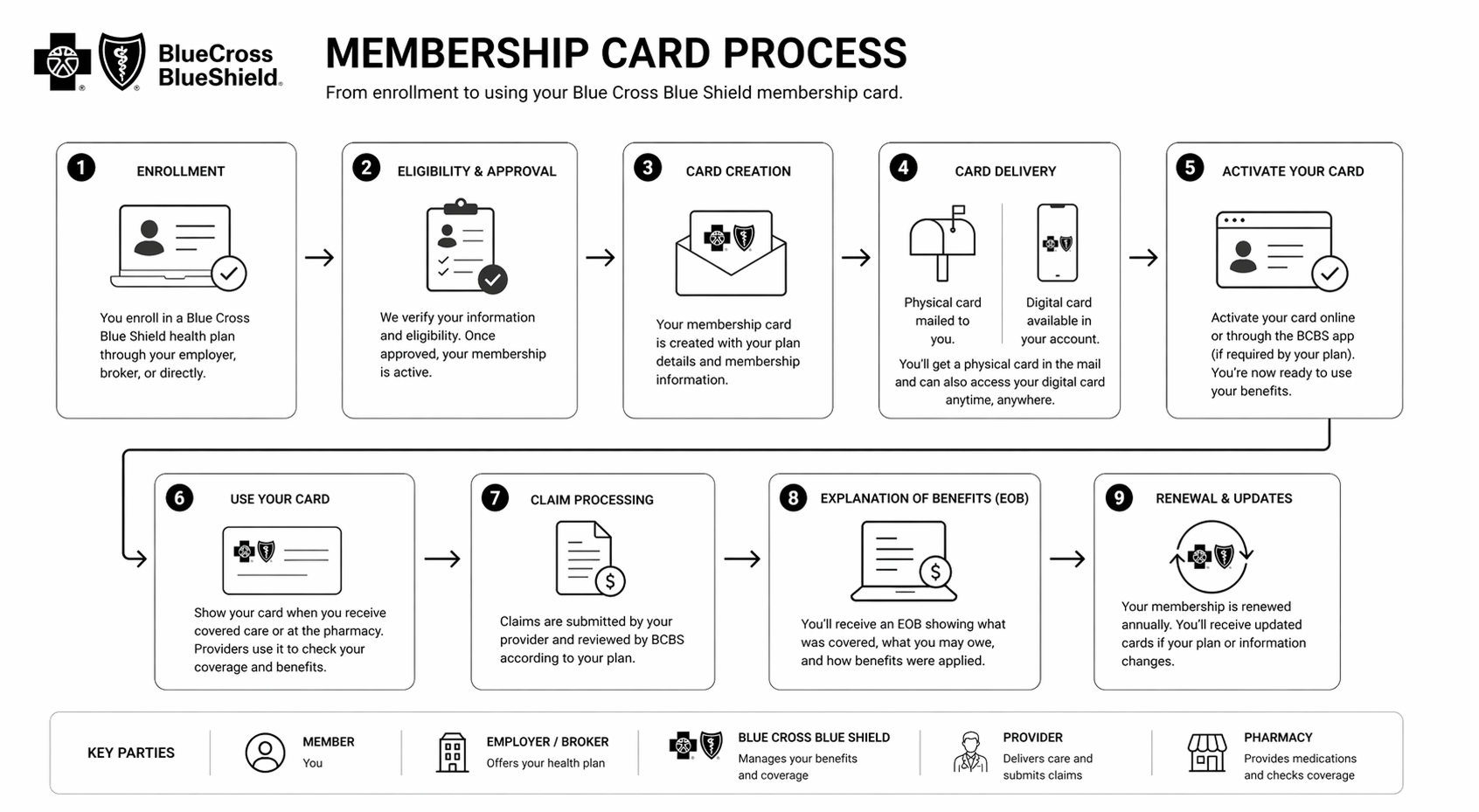
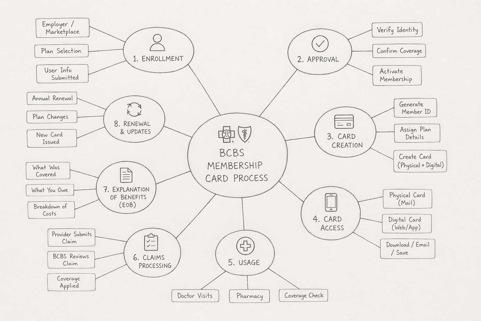
Info Graphics: